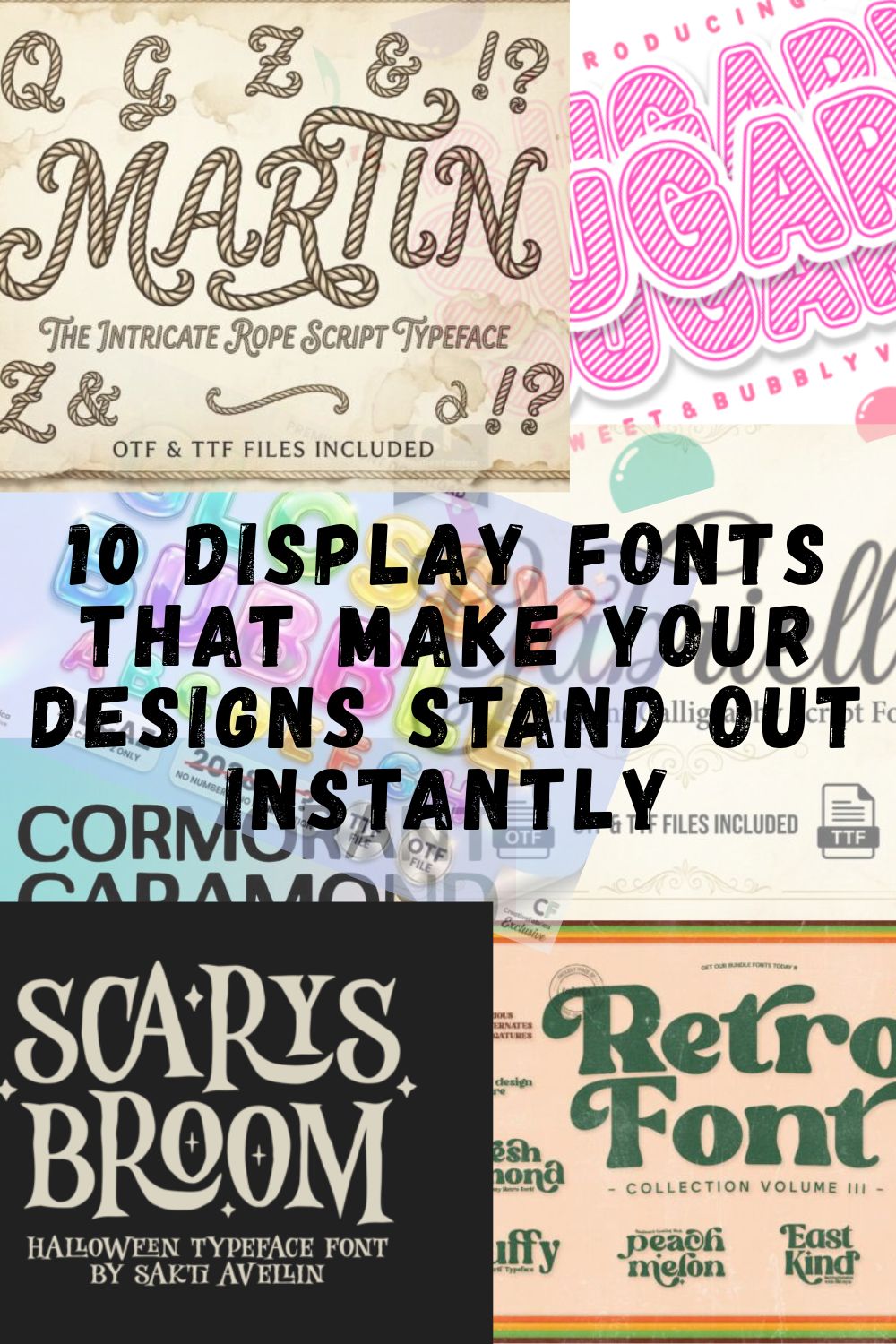
10 Display Fonts That Make Your Designs Stand Out Instantly
Display fonts are usually my first choice when I want a design to instantly grab attention and make a strong visual statement, and over time I’ve built a small collection of Display Fonts that I keep coming back to whenever I need something bold, expressive, and full of personality, so in this post I’m sharing 10 display fonts that I regularly use in my projects to create designs that feel modern, eye-catching, and impossible to ignore.
1. Dust Stamp Display Font
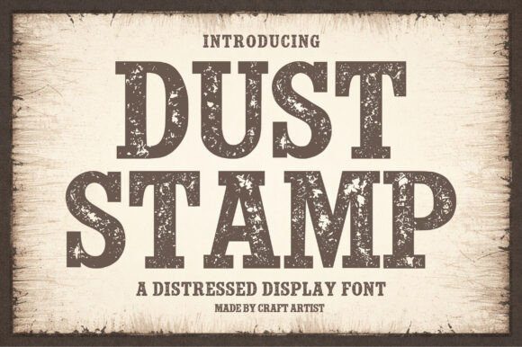

When I’m scouring the web for high-impact display fonts, I’m usually looking for something that doesn’t just sit on the page but actually tells a story. That’s why Dust Stamp immediately caught my eye—it’s a bold, distressed typeface that feels like it was pulled straight off a vintage letterpress. With its heavy slab serif forms and that authentic, worn texture, it brings a gritty, handcrafted soul to any layout.

I’ve found that this is one of those versatile display fonts that works wonders when you need a «human» touch in a digital space. Whether I’m mocking up a rugged logo, a retro poster, or some tactile-looking packaging, those heavy strokes and weathered details add instant depth. It hits that sweet spot between a grunge aesthetic and solid readability, making it a perfect choice for any project that needs to feel timeless, rustic, and impossible to ignore.
2. Varsity College Sporty Bundle Display Font
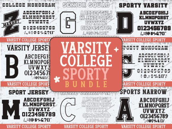

There’s something about that classic stadium energy that never goes out of style, which is exactly why I’m so hyped to share the Varsity College Sporty Bundle. When I was putting this together, I wanted to capture that raw, high-stakes feeling of a Saturday afternoon game—the grit, the cheering, and the bold legacy of letterman jackets. As far as any display font goes, this one is all about presence; it takes those traditional, blocky athletic silhouettes and gives them a crisp, modern edge that pops on screen and in print.
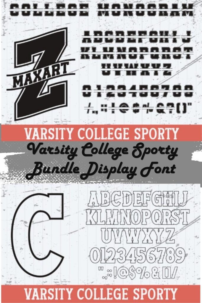
In my own workflow, I’ve found that this specific display font is a total lifesaver for anything that needs to feel «official» and high-energy. Whether I’m mocking up custom team jerseys, designing spirit wear for a local college, or even just creating some punchy home decor, these letterforms carry a weight that commands attention. If you’re looking to give your project that «big game» feel while keeping things clean and professional, this bundle is the powerhouse you’ve been waiting for.
3. Bright Burn Display Font
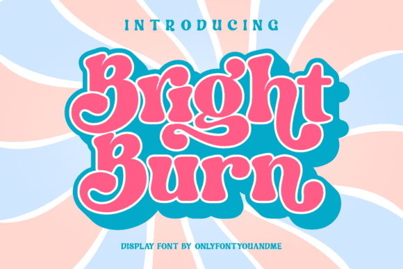

When I’m in the middle of a project that feels a bit too «safe,» I always reach for something with a little more soul—and that’s exactly where Bright Burn comes in. As a designer, I’m constantly looking for a display font that can bridge the gap between nostalgic retro vibes and a playful, modern energy. It’s got this effortless «cool» factor that reminds me of vintage posters and indie magazines, making it one of my favorite tools for injecting personality into a layout.
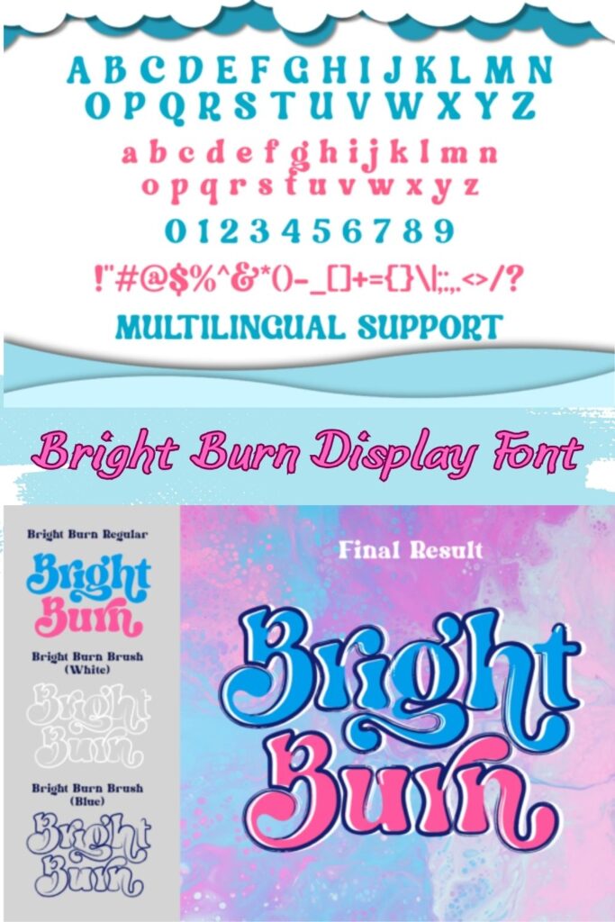
What I really love about using this particular display font is how accessible it is. Since it’s fully PUA encoded, I don’t have to jump through hoops to find those unique glyphs and alternates that give a brand its own thumbprint. Whether I’m mocking up a high-end logo, setting a bold headline for a digital magazine, or building out a fresh branding identity, Bright Burn stays readable while looking incredibly custom. It’s all about making those «big» design moments feel both fun and professional.
4. Trup & Tomp Display Font
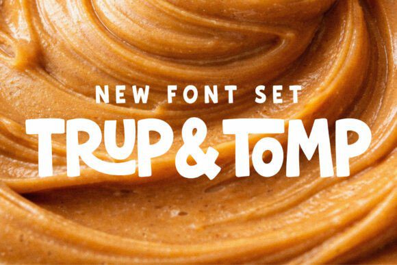

Whenever I’m staring at a blank canvas and a project feels a bit too «clinical,» I know it’s time to break out Trup & Tomp. As a designer, I’ve always believed that the best work comes from a sense of play, and this duo is exactly that—a chunky, hand-drawn display font paired with a fluid, soulful script. I designed this set specifically for those moments when you need a «loud» headline to have a little more heart and a lot more personality than a standard typeface could ever offer.
What makes this my favorite «secret weapon» in my kit is the dynamic contrast between the two. In my own branding and packaging work, I love using the bold, sans-serif display font for high-impact titles and then tucking the handwritten script underneath for that organic, human touch. Whether I’m working on a playful children’s book, a modern lifestyle poster, or punchy social media graphics, Trup & Tomp ensures the typography doesn’t just sit there—it actually speaks to the audience.
5. Stacked Chunky Display Font
There are days in the studio when a project just needs to stop taking itself so seriously, and that’s exactly when I pull out Stacked Chunky. As a designer, I’m always looking for a display font that can pack a punch without feeling aggressive, and this typeface hits that «sweet spot» perfectly. It’s got this incredible, bouncy energy—heavy enough to anchor a layout, but with rounded edges that keep everything feeling approachable and fun. Whenever I’m working on world-building for a casual game or designing high-energy YouTube thumbnails, this is the display font I rely on to bring that «pop» of youthful vigor.
What I love most about experimenting with Stacked Chunky in my own work is how well it takes to bold styling. If you throw a sticker-style offset or a thick white border around it, the letters practically jump off the screen. It’s the kind of display font that thrives in a maximalist environment; I usually pair it with hand-drawn sparkles or bright, candy-store colors to really lean into that playful aesthetic. Whether it’s for a new toy line or digital planner stickers, it delivers a massive helping of character while keeping every word perfectly legible—a rare win-win in the world of bold typography.
6. Phoebe Display Font
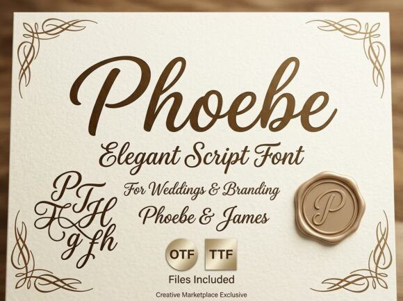
When I’m looking to break away from the «standard» and create something truly soulful, Phoebe is the first typeface I reach for. As a designer, I’ve always believed that typography shouldn’t just deliver a message—it should be the message. This particular display font is a masterclass in decorative detail, offering a strong visual personality that instantly becomes the center of attention in any layout. It’s got these intricate, artistic elements that feel high-end and polished, yet it keeps a raw creative edge that’s perfect for those «wow» moments we all strive for in our portfolios.
In my own studio practice, I’ve found that this display font is incredibly versatile despite its bold character. Whether I’m mocking up a premium album cover, building a unique brand identity for a creative startup, or just trying to make a social media quote actually stop the scroll, Phoebe does the heavy lifting. It works seamlessly across my usual Adobe suite, but I also love that it’s accessible for quick hits in Canva or Cricut projects. If you’re looking for a display font that bridges the gap between professional precision and pure artistic flair, Phoebe is definitely a tool you need in your kit.
7. Tiffany Display Font

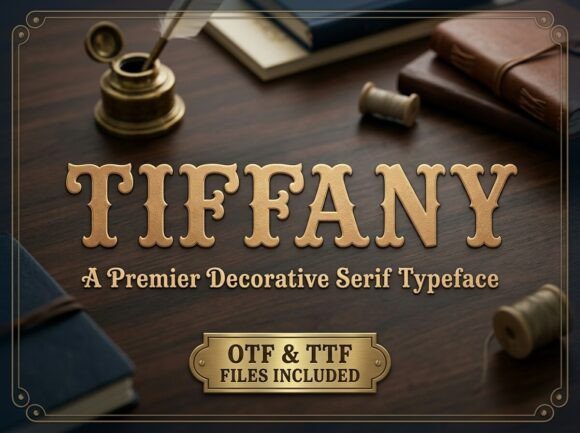
There is a specific kind of magic in «vintage-luxe» aesthetics that is incredibly hard to get right, but Tiffany nails it every single time. Whenever I’m designing for a boutique brand or a high-end editorial project, I find myself looking for a display font that carries a sense of history without feeling dusty. Tiffany is exactly that—a decorative serif that feels like a whisper of old-world elegance. With its soft, scalloped terminals and that stunning textured grain, it brings a tactile, high-end craftsmanship to the screen that you usually only find in bespoke letterpress stationery.
What I personally appreciate most about using this display font in my workflow is the rhythmic baseline and those unique character curves. They provide a «human touch» that keeps a design from feeling too clinical or stiff. Whether I’m crafting a sophisticated wedding suite, a luxury masthead, or a delicate watermark for professional photography, Tiffany adds an instant layer of intimacy and polish. If your goal is to make a project feel expensive, intentional, and timelessly beautiful, this is the display font I’d put at the top of your list.
8. Longfellow Lace Family Display Font
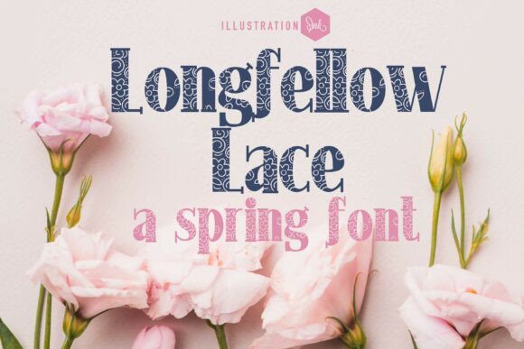
In the design world, we often talk about the tension between strength and delicacy, and Longfellow Lace is the literal embodiment of that balance. When I first started experimenting with this family, I was struck by how it subverts the typical heavy slab-serif. It’s a powerhouse display font that uses a sturdy, commanding skeleton as a canvas for incredibly intricate floral and lace patterns. It’s rare to find a typeface that carries such significant visual weight while simultaneously feeling airy and refined through its negative-space detailing—it’s essentially a graphic illustration and a font rolled into one.
From a designer’s perspective, this is the kind of display font you use when the typography needs to do all the heavy lifting in a layout. I’ve found it works wonders for «vintage-luxe» projects where you want to evoke a sense of heritage and artisanal craftsmanship. Whether I’m mocking up a romantic editorial title or a logo for a high-end boutique, Longfellow Lace adds a layer of sophisticated texture that you just can’t get from a standard flat serif. It’s more than just a way to write a headline; it’s a centerpiece that brings a romantic, spring-inspired energy to any creative canvas.
9. Grinched Display Font

When the holiday season rolls around—or whenever a project calls for a dash of «mischievous charm»—Grinched is the first tool I pull from my kit. As a designer, I love a display font that doesn’t just sit on the baseline but actually has a pulse. This typeface captures that perfect «holiday villain» energy with its slightly cartoonish, sharp-edged letterforms that feel both playful and a little bit cheeky. It’s got a heavy, energetic presence that makes it impossible to ignore, which is exactly what you want when a design needs to break through the noise.
In my own work, I’ve found this display font to be a total powerhouse for high-impact headlines and festive event posters. Even though it leans into a fun, spirited aesthetic, it doesn’t sacrifice that bold authority needed to anchor a layout. Whether I’m designing for a themed social media campaign or creating eye-catching merchandise, Grinched brings an instant «wow» factor that feels custom-made. It’s all about embracing that lively, expressive character to give your audience something they’ll actually remember.
10. Romantic Aura Duo Font
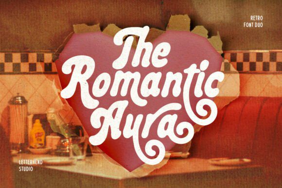

When I’m looking to inject a project with a serious dose of «good vibes» and 70s nostalgia, Romantic Aura is the first duo I reach for. As a designer, I’m constantly chasing that perfect balance between retro soul and modern usability, and this display font delivers exactly that with its thick, curvaceous bubble letters and rhythmic flow. It’s got this incredible «cool» factor that feels like a vintage vinyl cover or a psychedelic concert poster, making it a total powerhouse for anyone who wants their typography to actually have a heartbeat.
In my own creative process, I’ve found that this display font really comes alive when you pair it with grainy textures or neon, high-contrast palettes. Because it’s a duo, the interplay between the letterforms creates a sense of movement that’s perfect for youth-oriented editorial pieces or high-impact social media graphics. Plus, since it’s PUA-encoded, I can easily swap in swashes and alternates to give a brand identity that truly bespoke, hand-lettered feel. Whether it’s for a Valentine’s Day campaign or a bold apparel line, Romantic Aura ensures your message isn’t just seen—it’s felt.
Final Thoughts
Choosing the right display font is often the most critical decision in the entire creative process. It’s the difference between a design that simply «looks nice» and one that actually stops the scroll and starts a conversation. From the vintage grit of weathered textures to the high-energy vibes of varsity lettering, these ten options offer a massive range of storytelling potential for your next big project.
I’d love to see how you all put these to use! Typography is a playground, so don’t be afraid to experiment with bold offsets, neon gradients, or layered textures to make these display fonts your own. Which one of these is calling your name? Drop a comment below or tag me in your latest creations—I’m always looking for fresh inspiration from this amazing design community. Keep creating!