
10 Strong Slab Serif Fonts Perfect for Headlines and Branding
When it comes to making typography feel strong, structured, and full of character, I always reach for Slab Serif Fonts, and I’ve curated a set of 10 fonts that I consistently use in my projects because they combine readability with bold style, so in this post I’m sharing my favorite Slab Serif Fonts that help me create designs that are both modern and impactful without losing personality or clarity.
1. Loved Slab Serif Font


When I’m working on a project that needs to feel «hand-stamped» and heartfelt, Loved is the first typeface I pull from my collection. As a designer, I’ve found that the best slab serif fonts are those that offer a bit of tactile soul, and this bold vintage stamp typeface delivers exactly that. It captures the authentic, slightly imperfect charm of a classic rubber stamp, making it my go-to secret weapon for romantic branding, Valentine-inspired designs, or those cozy «love quotes» that need a touch of human warmth. It’s a masterclass in combining a heavy, grounded structure with a soft, emotional personality.
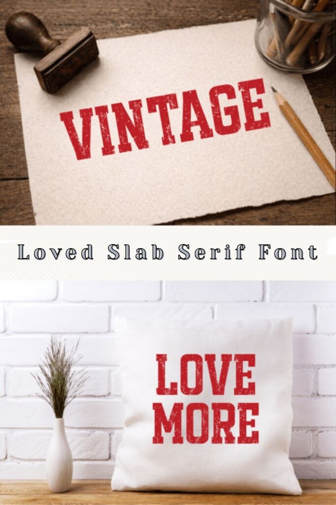
In my own studio workflow, what makes this specific slab serif font so indispensable is its dual-style versatility. I can use the distressed, textured version to give a t-shirt or a greeting card a rugged, retro look, or switch to the clean, solid style for a more modern, «printable» aesthetic. Unlike many other slab serif fonts that can feel a bit too industrial, Loved works beautifully for tactile products like mugs, tote bags, and artisanal packaging. Whether I’m designing for a small business or a personal crafting project, it delivers a high-impact, bold display that feels both professional and handmade. If you’re looking to diversify your library of slab serif fonts with something that packs a massive amount of character and «vintage stamp» soul, Loved is a top-tier choice for any creative canvas.
2. Lemonade Fabrica Slab Serif Font

When I’m looking for a typeface that feels as refreshing as its name suggests, Lemonade Fabrica is the first one I pull from my collection. As a designer, I’m always on the hunt for slab serif fonts that can do the heavy lifting in a layout while maintaining a distinct, approachable personality. Inspired by classic typography but updated with a crisp, modern edge, this font is a masterclass in versatility. It has a fantastic structural weight that makes it an absolute powerhouse for headlines, yet it remains surprisingly legible when you scale it down for smaller blocks of text.
In my own studio projects, I’ve found that Lemonade Fabrica is an incredible all-rounder. Unlike some more «industrial» slab serif fonts that can feel a bit cold, this one brings a unique style that works spectacularly across web, print, and even motion graphics. Whether I’m mocking up a bold hero banner for a new website or designing high-impact packaging for a boutique brand, it delivers a polished, professional look that never feels generic. If you’re looking to expand your library of slab serif fonts with a choice that offers both maximum character and reliable functionality, Lemonade Fabrica is a «spectacular» essential for any creative toolkit.
3. Klister Slab Serif Font

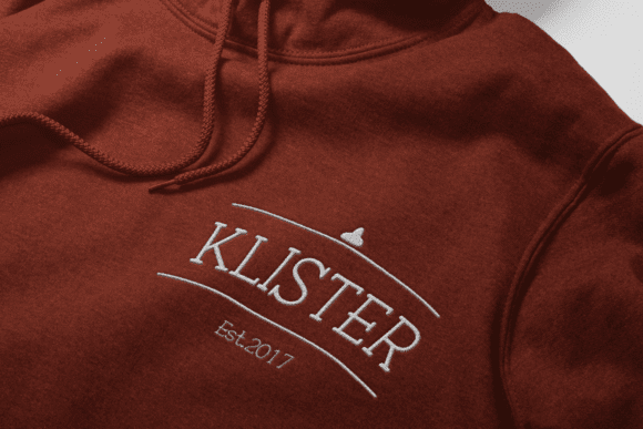
When I want to strip away the «over-polished» feel of digital design and inject some raw, mechanical soul into a layout, Klister is the first typeface I reach for. As a designer, I’ve found that the most compelling slab serif fonts are often those that embrace imperfection, and Klister is a beautifully executed tribute to the typewriter era. It’s not just a monospaced font; it’s a «typewriter style» powerhouse that captures the uneven ink and heavy tactile grit of a vintage Remington. It’s my go-to secret weapon for storytellers and journalists who need their words to carry an inherent sense of history, mystery, and «hand-typed» truth.
In my own studio experiments, I’ve found that Klister is an absolute dream for projects leaning into that «dark academia» or «industrial» aesthetic. Unlike more rigid, geometric slab serif fonts, this one excels at creating a sense of intimacy—it works perfectly for «from the desk of» stationery, noir-themed book covers, or small-batch coffee labels. Whether I’m mocking up a vintage-style menu or designing a minimalist website that needs a «mechanical heartbeat,» it delivers a layer of transparency and «raw» authenticity that is hard to find elsewhere. if you’re looking to expand your library of slab serif fonts with something that feels both nostalgic and incredibly sturdy, Klister is a top-tier choice for any project that demands a sense of «handmade» prestige.
4. SChalkboard 2.0 Slab Serif Font
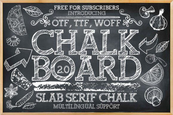
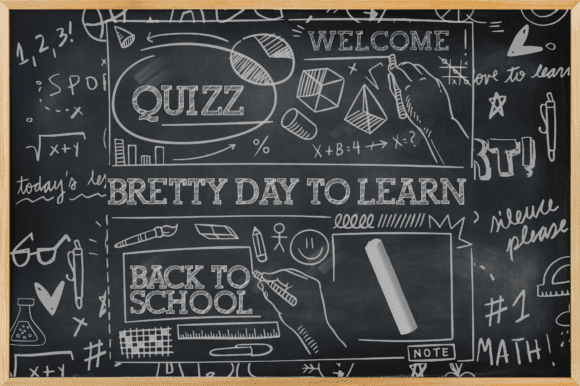
When I’m working on a project that needs to feel approachable and tactile—like a local bistro menu or a creative educational brand—Chalkboard 2.0 is the first typeface I pull from my collection. As a designer, I’ve found that many slab serif fonts can feel a bit too rigid or industrial, but this version flips the script by blending a bold, blocky structure with a playful, hand-drawn chalk texture. It’s a masterclass in adding a «human touch» to a layout, offering a rustic charm that instantly makes a design feel cozy and welcoming.
In my own studio experiments, I’ve found that Chalkboard 2.0 is an absolute powerhouse for «back-to-school» themes or branding for artisanal Italian restaurants and cozy cafés. Unlike more traditional slab serif fonts, this one carries a rhythmic, organic energy that makes every word feel like it was freshly written on a slate board. Whether I’m mocking up a storefront sign or designing social media graphics for a boutique bakery, it delivers a level of «vintage warmth» that is hard to find elsewhere. If you’re looking to diversify your library of slab serif fonts with something that is both stylish and incredibly versatile, Chalkboard 2.0 is a reliable, character-filled essential for any creative toolkit.
5. Cowboy Bundle Slab Serif Font
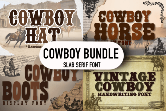

When I’m tasked with a project that needs to capture the rugged, untamed spirit of the frontier, the Cowboy Bundle is the first set I pull from my archive. As a designer, I’ve found that few styles carry as much immediate personality as Western-inspired slab serif fonts. This collection is a masterclass in «Wild West» aesthetics; it features those iconic, heavy-blocked serifs and weathered silhouettes that instantly evoke images of classic saloons and hand-painted posters. It’s my go-to secret weapon for when a brand needs to feel bold, established, and full of vintage charm.
In my own studio experiments, I’ve found that the Cowboy Bundle is an absolute powerhouse for things like artisanal leather-work branding, craft brewery labels, or high-impact event posters. Unlike more modern, sterile slab serif fonts, this bundle offers a range of rustic textures that make every word feel like it was branded onto wood or printed on an old-school press. Whether I’m mocking up a logo for a heritage-inspired boutique or designing a title for a rustic outdoor festival, it delivers a level of «old-world» authority that is hard to find elsewhere. If you’re looking to expand your library of slab serif fonts with a choice that is simple, sturdy, and undeniably charismatic, this bundle is an essential tool for any designer aiming for a timeless, rugged finish.
6. Antique Hard Slab Serif Font
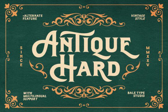

When a project demands a foundation of pure, unshakeable authority, Antique Hard is the first typeface I pull from my digital archives. As a designer, I’ve always been fascinated by the grit and grace of 19th-century craftsmanship, and this font is a masterclass in Victorian-era artistry. It draws heavy inspiration from classic sign painting, featuring the kind of bold, sturdy letterforms that once commanded attention on storefronts and broadside posters. Unlike many modern slab serif fonts that can feel a bit too clinical, Antique Hard carries a nostalgic charm that makes every headline feel like it was hand-carved with intention.
In my own studio workflow, I’ve found that Antique Hard is an absolute powerhouse for high-end logotypes and premium packaging. It has a «solid» presence that instantly grounds a design, making it a go-to secret weapon for branding projects that need an «old-school» or sophisticated heritage look. One of the biggest wins for me is its multi-language support, which is a lifesaver when I’m working on international editorial designs that still need to maintain that specific Victorian aesthetic. Whether I’m mocking up a formal invitation or designing a bold title for a craft spirit label, it delivers a level of «antique» prestige that is hard to find in other slab serif fonts. If you’re looking to anchor your creative toolkit with a font that feels both monumental and timeless, Antique Hard is a reliable, high-impact essential.
7. Monarko Slab Serif Font
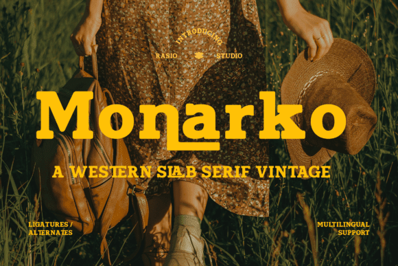

When a project calls for a «no-nonsense» aesthetic that still feels steeped in history, Monarko is the first typeface I pull from my collection. As a designer, I’ve found that the most effective slab serif fonts are those that feel like they could have been hand-painted on a weathered wooden storefront. Monarko is a masterclass in this rugged, Western-inspired charm; its strong, robust letterforms are built on thick slab serifs and structural details that instantly evoke the spirit of the frontier. It’s my go-to secret weapon for when a brand needs to feel immovable, grounded, and full of vintage personality.
In my own studio workflow, I’ve found that Monarko is an absolute powerhouse for high-impact signage and «old-school» editorial posters. Unlike more delicate or modern slab serif fonts, its heavy-duty presence ensures that your headlines command the room without losing that authentic, rustic soul. Whether I’m mocking up a logo for a heritage-inspired brewery or designing a title for a classic outdoor brand, it delivers a level of «western grit» that is hard to find elsewhere. If you’re looking to diversify your library of slab serif fonts with a choice that is both incredibly sturdy and full of character, Monarko is a reliable, high-impact essential for any creative toolkit.
8. JP Sport Stacked Slab Serif Font
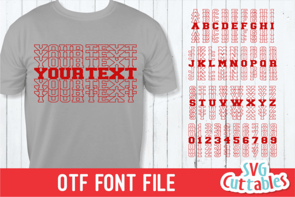
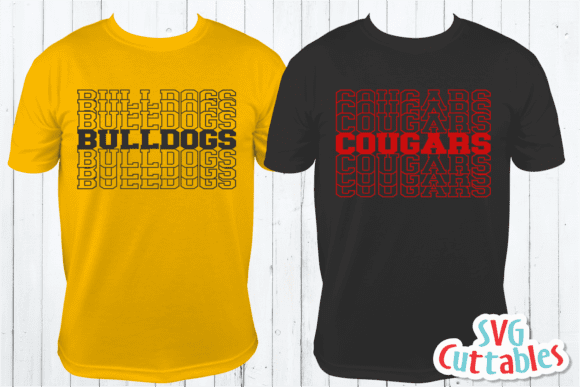
When a project needs to hit like a heavyweight champion, JP Sport Stacked (famously known as Bulldogs) is the first typeface I pull from my collection. As a designer, I’m always on the hunt for slab serif fonts that don’t just sit on the page but actually command the entire layout. This font is a masterclass in assertive typography; it features incredibly bold, thick letterforms that feel immovable and powerful. It’s my go-to secret weapon for sports branding, high-energy digital designs, or any presentation where the headers need to carry an unshakeable sense of confidence.
In my own studio workflow, what makes this specific slab serif font such a favorite is its pure versatility across different mediums. Unlike some more «decorative» styles, its clean but massive structure works just as well on a physical greeting card or craft project as it does on a massive digital billboard. Whether I’m mocking up a logo for a local athletic team or designing a high-impact title for a tech presentation, it delivers a level of «visual muscle» that is hard to find elsewhere. If you’re looking to diversify your library of slab serif fonts with a choice that is both incredibly sturdy and undeniably bold, JP Sport Stacked is a reliable, «all-occasion» essential for any creative toolkit.
9. Fox Paint Slab Serif Font
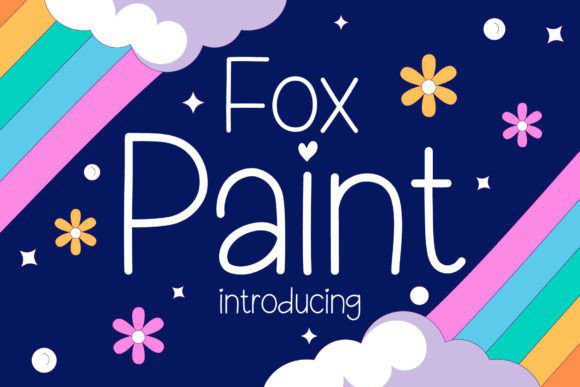
When a project calls for a dose of personality without losing its structural integrity, Fox Paint is the first typeface I pull from my collection. As a designer, I’m always on the lookout for slab serif fonts that can break away from the traditional, rigid «industrial» look and offer something a bit more organic. This font is a masterclass in playful handwritten charm; it takes the familiar, bold shapes of a slab serif and softens them with a unique, hand-drawn texture that feels both «cool» and incredibly approachable. It’s my go-to secret weapon for when a brand needs to feel human, creative, and full of life.
In my own studio workflow, I’ve found that Fox Paint is an absolute powerhouse for things like social media quotes, creative blog headers, and boutique invitations. Unlike more formal slab serif fonts, its «fox-like» agility allows it to sit perfectly in a fun, youthful layout while still maintaining the high-impact presence of a heavy serif. Whether I’m mocking up a logo for a modern craft brand or designing a title for a lifestyle blog, it delivers a level of «playful grit» that is hard to find elsewhere. If you’re looking to diversify your library of slab serif fonts with a choice that feels both trendy and handwritten, Fox Paint is a reliable, character-filled essential for any creative toolkit.
10. Ruganic Slab Serif Font

When a project calls for a bridge between raw, organic beauty and structural authority, Ruganic is the first typeface I pull from my collection. As a designer, I’m constantly searching for slab serif fonts that can break away from the «industrial» stereotype to offer something more artisanal. This font family is a masterclass in rustic infusion; it takes the sturdy, dependable nature of a slab serif and breathes a botanical, hand-lettered soul into every character. It’s my go-to secret weapon for branding nature-born products, sustainable cosmetics, or wellness labels where the typography needs to resonate with authenticity and craftsmanship.
In my own studio workflow, what really sets Ruganic apart from other slab serif fonts is its incredible design maneuverability. With an extended character set and a range of weights, it allows me to maintain a consistent «organic» voice across everything from high-impact editorial headlines to intricate digital narratives. Unlike more rigid or sterile typefaces, it captures the spirit of vintage botanical visuals while ensuring professional-grade legibility through refined kerning and spacing. Whether I’m mocking up a logo for a small-batch apothecary or designing environmental graphics for an eco-conscious brand, it delivers a level of «natural prestige» that is hard to find elsewhere. If you’re looking to diversify your library of slab serif fonts with a choice that feels both ancient and modern, Ruganic is a reliable, high-impact essential for any creative toolkit.
Final Thoughts
Using Slab Serif Fonts in my work has taught me that the right typeface can completely define a design’s tone, because these fonts bring a balance of strength and elegance that works across headers, posters, branding, and digital content, and these 10 fonts are my go-to choices whenever I want typography that makes a bold statement while still feeling clean, readable, and stylish.