
10 Unique Dingbats Fonts for Creative and Modern Designs
In the evolving world of typography, Dingbats fonts serve as the ultimate professional shortcut, turning your keyboard into a versatile palette of icons, symbols, and hand-drawn illustrations. As a designer, I’ve found that these specialized typefaces are essential for streamlining workflows, allowing you to «type» high-quality visual elements directly into your layouts without hunting for external vector files. In this guide, I’m sharing ten of my favorite Dingbats fonts that perfectly bridge the gap between traditional text and expressive, theme-driven art.
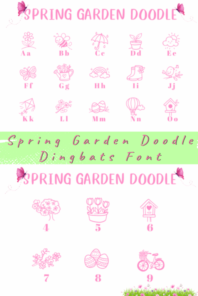
1. Spring Garden Doodle Dingbats Font
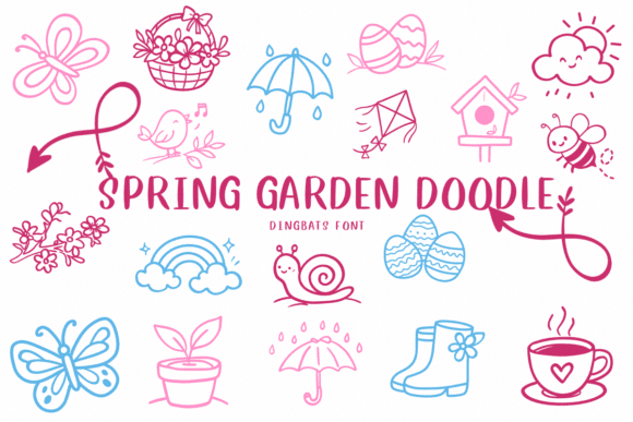

When the seasons shift and I need to sprinkle some organic, hand-drawn charm into my layouts, Spring Garden Doodle is the first asset I pull from my library. As a designer, I’ve found that the real beauty of Dingbats fonts lies in their sheer efficiency; instead of hunting through massive vector folders, I can simply «type» out a whimsical garden scene directly from my keyboard. This particular collection is a masterclass in seasonal storytelling, featuring 52 hand-drawn characters that range from delicate butterflies and rabbits to rustic watering cans. It’s my go-to secret weapon for when a project needs to feel handcrafted and filled with the effortless joy of a blooming spring morning.
In my own studio workflow, I’ve found that Dingbats fonts like this one are absolute lifesavers for creating cohesive educational worksheets, seasonal planners, and festive party banners. Because each doodle is mapped to a letter, it’s incredibly easy to accent a digital invitation or build out a custom sticker sheet without breaking my creative rhythm. Whether I’m designing a series of scrapbooking layouts or mocking up some «nature-magic» nursery decor, the Spring Garden Doodle typeface delivers a level of «illustrated warmth» that is hard to achieve with standard iconography. If you’re looking to expand your toolkit with Dingbats fonts that bridge the gap between typography and illustration, this garden-themed set is a high-impact essential for any DIY craft project.
2. Heart Beat Dingbats Font
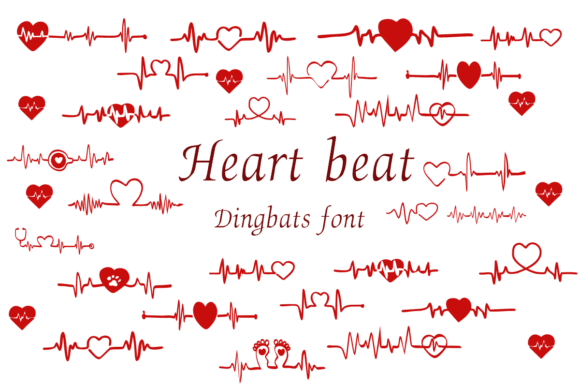

When a project needs to feel alive with emotion, Heart Beat is the first asset I pull from my collection. As a designer, I’ve found that the real power of Dingbats fonts lies in their ability to translate complex feelings into simple, typeable symbols. This isn’t just a collection of static icons; it’s a rhythmic set of heart-shaped pulses where each character seems to dance to its own beat. It’s my go-to secret weapon for adding a «pulse» of love and excitement to a layout without having to manually draw out EKG lines or custom heart flourishes.

In my own studio workflow, I’ve found that Dingbats fonts like this one are absolute lifesavers for romantic branding, medical-themed infographics with a whimsical twist, or even just adding a little «heartfelt» spark to social media quotes. Because it’s a font, I can easily change the color, size, and spacing of these heartbeat motifs as quickly as I would a standard letter. Whether I’m designing a minimalist wedding invitation or a high-energy fitness app interface, the Heart Beat typeface delivers a level of «visual rhythm» that feels both playful and profoundly human. If you’re looking to give your designs a literal heartbeat, integrating these types of Dingbats fonts is the most efficient way to ensure your creative work resonates with a genuine, rhythmic charm.
3. Wedding Ornaments Dingbats Font
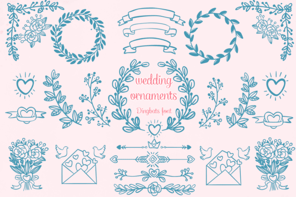

When I’m designing for a high-end wedding or a boutique bridal brand, the Wedding Ornaments collection is the first thing I reach for to add that «bespoke» touch. As a designer, I’ve found that the real beauty of Dingbats fonts lies in their ability to provide consistent, sophisticated flourishes without the need to hunt through endless vector libraries. This particular typeface is a curated treasure trove of romantic motifs—think delicate laurels, ornate dividers, and graceful floral accents—that allow me to «type» elegance directly into my layouts. It’s my go-to secret weapon for transforming a standard invitation into a luxury piece of stationery with just a few keystrokes.
In my own studio workflow, I’ve found that Dingbats fonts like this one are absolute lifesavers for creating cohesive branding across an entire event, from the initial «Save the Date» to the final reception menus. Because these ornaments are mapped to a font file, I can easily adjust their size and color to match the couple’s palette perfectly, ensuring every DIY craft and decoration feels intentional and high-end. Whether I’m designing a custom monogram for a logo or adding subtle corner flourishes to a seating chart, the Wedding Ornaments typeface delivers a level of «illustrated polish» that is hard to achieve with generic clip art. If you’re looking to elevate your creative projects with Dingbats fonts that bridge the gap between classic calligraphy and modern graphic design, this ornate set is a must-have for your romantic design toolkit.
4. Framerly Dingbats Font
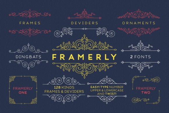

When a layout feels a bit too «open» and needs a sophisticated anchor, Framerly is the first asset I pull from my collection. As a designer, I’ve found that the real beauty of Dingbats fonts lies in their ability to provide instant structural elegance without the need for complex vector masking. This gorgeous collection is a masterclass in ornamental design, offering a charming set of frames that can instantly elevate a simple block of text into a high-end editorial piece. It’s my go-to secret weapon for when I want to add a polished, «finished» look to a project with just a single keystroke.
In my own studio workflow, I’ve found that Dingbats fonts like this one are absolute lifesavers for creating stunning borders for certificates, wedding programs, or boutique product labels. Since Framerly comes in two distinct versions, it gives me incredible creative freedom to mix and match styles—from minimalist, modern borders to more ornate, classic flourishes. Because these frames are mapped to a font file, I can easily adjust their weight, color, and scale within my text box, ensuring a perfect fit every time. If you’re looking to add professional structure to your designs while keeping your workflow fast and flexible, integrating these types of Dingbats fonts is the ultimate shortcut to a refined and framed aesthetic.
5. Light Bulb Dingbats Font
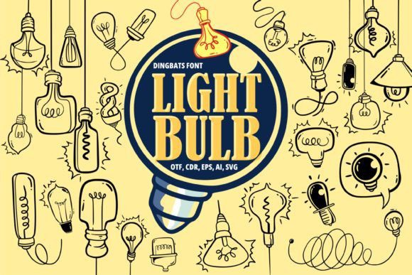
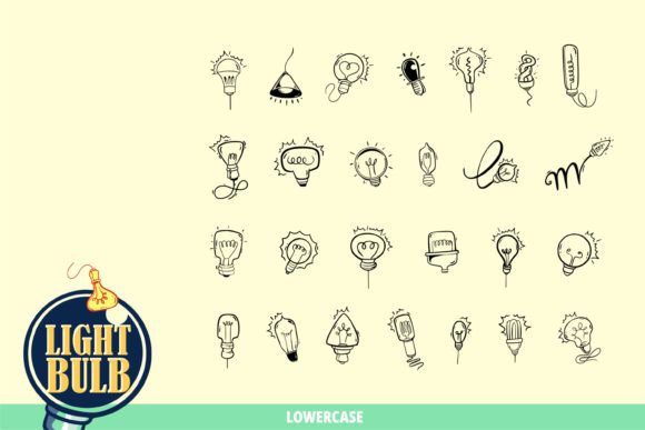
When I’m looking to illuminate a concept or add a «eureka» moment to a layout, Light Bulb is the first asset I pull from my collection. As a designer, I’ve found that the real beauty of Dingbats fonts lies in their ability to provide thematic consistency across a project without the need for manual illustration. This particular typeface is a treasured delight, brimming with exclusivity and painstakingly curated details in every character. It’s my go-to secret weapon for when a design needs to beam with ingenuity—whether I’m accenting a brainstorming-themed invitation or adding a literal spark of enchantment to a craft project.
In my own studio experiments, I’ve found that Dingbats fonts like this one are invaluable because they seamlessly assimilate into any aesthetic, from the whimsical to the sober. Because these light-bulb motifs are mapped to a font file, I can «type» out a glowing idea as easily as I would a headline, adjusting the size and color to match the project’s unique «pulse.» Whether I’m designing a series of educational cards or a modern infographic about innovation, the Light Bulb typeface delivers a level of «visual glow» that instantly elevates the entire creative repertoire. If you’re looking to let your creative impulses shine brighter than ever, integrating these types of Dingbats fonts is the ultimate shortcut to a high-impact, ingenious design.
6. Chemical Doodle Dingbats Font
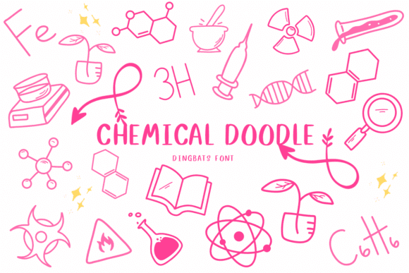

When I’m working on a project that needs to feel like a brainstorm captured in a scientist’s lab notebook, Chemical Doodle is the first asset I pull from my stash. As a designer, I’ve found that the real beauty of Dingbats fonts lies in their ability to provide a specialized aesthetic—like these perfectly imperfect, hand-sketched beakers and molecular structures—without the need for complex vector assets. This font is a masterclass in the «sketched» style, offering an organic, human touch to what is usually a very rigid, scientific subject. It’s my go-to secret weapon for when a design needs to feel experimental, intellectual, and undeniably creative.
In my own studio workflow, I’ve found that Dingbats fonts like this one are absolute lifesavers for unique branding, quirky DIY crafts, and even themed event decorations. Because the illustrations are mapped to a font file, I can «type» out a chemical reaction as easily as I would a headline, adjusting the size and stroke color to match my layout’s unique «formula.» Whether I’m mocking up a logo for a craft brewery or adding a touch of genius to a high-impact poster, the Chemical Doodle typeface delivers a level of «sketched charm» that instantly elevates the entire creative project. If you’re looking to experiment with Dingbats fonts that bridge the gap between academic precision and artistic flair, this chemical-themed set is an essential element for your design repertoire.
7. Flower Doodles Dingbats Font

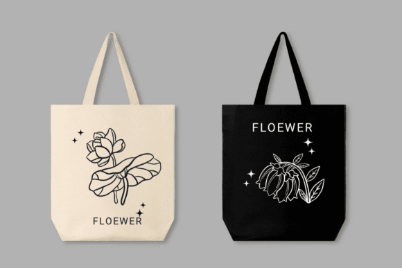
Whenever a layout feels a bit too rigid or clinical, I find that a quick dose of organic, hand-drawn botanicals is the perfect remedy. That is exactly why Flower Doodles has a permanent spot in my design rotation. As a designer, I appreciate that Dingbats fonts allow me to skip the tedious process of importing individual vector files; instead, I can simply «type» a garden of sketched florals directly into my text box. This font is a masterclass in the «sketched» aesthetic, offering a soft, human touch that feels like it was lifted straight from a traveler’s field journal. It’s my go-to secret weapon for projects that need to feel intimate, artisanal, and effortlessly charming.
In my own studio workflow, I’ve found that Dingbats fonts like this one are absolute lifesavers for high-impact wedding invitations, boutique logos, and personalized DIY crafts. Because the characters are mapped to my keyboard, I can experiment with different blooms and leaf motifs in seconds, adjusting the stroke color and scale to match the project’s unique palette. Whether I’m adding a subtle corner flourish to a decorative menu or building a complex floral pattern for a scrapbooking layout, the Flower Doodles typeface delivers a level of «handcrafted warmth» that instantly elevates the entire creative vision. If you’re looking to infuse your library with Dingbats fonts that bridge the gap between classic floral illustration and modern graphic design, this sketched set is an essential element for your creative toolkit.
8. Music Notes Dingbats Font
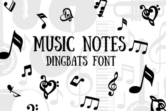
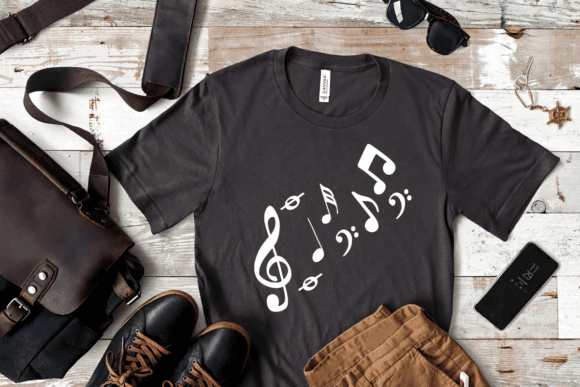
When I’m designing for a concert series or a local music school, the Music Notes typeface is the first asset I pull from my collection to set the right tempo. As a designer, I’ve found that the real beauty of Dingbats fonts lies in their ability to keep me in the «creative zone»—instead of leaving my layout to hunt for vector clefs or eighth notes, I can simply «type» a melodic sequence directly into my text box. This font replaces standard letters and numbers with beautifully rendered musical symbols, from elegant treble clefs to complex rhythmic notes. It’s my go-to secret weapon for when a project needs to feel lyrical, organized, and perfectly in tune with its theme.
In my own studio workflow, I’ve found that Dingbats fonts like this one are absolute lifesavers for adding musical decorations to concert programs, DIY instrument labels, or high-impact social media headers. Because these symbols are mapped to a font file, I can adjust their tracking, color, and size as easily as I would a regular headline, ensuring they harmonize perfectly with the rest of the typography. Whether I’m mocking up a minimalist logo for a record store or adding a subtle rhythmic flourish to a wedding program’s music list, the Music Notes typeface delivers a level of «visual sound» that is hard to achieve with generic clip art. If you’re looking to give your designs a literal pulse, integrating these types of Dingbats fonts is the most efficient way to ensure your creative work hits all the right notes.
9. United Scripts Dingbats Font


When I’m designing regional branding or custom apparel that needs a cozy, «hometown» feel, United Scripts is the first asset I pull from my collection. As a designer, I’ve found that the true genius of Dingbats fonts lies in their ability to condense complex, hand-lettered compositions into a few simple keystrokes. Instead of spending hours perfecting the curves of a script for each individual state, this unique typeface allows me to «type» out professionally hand-written names of all 50 U.S. states. It’s my go-to secret weapon for creating that authentic, artisanal look in a fraction of the time it would take to illustrate it from scratch.
In my own studio workflow, I’ve found that Dingbats fonts like this one are absolute lifesavers for rapid merchandising and personalized gift designs. What sets United Scripts apart is that the number keys and punctuation don’t just sit idle—they contain perfectly paired supporting phrases like «Calls Me Home» or «My Heart Is In.» This means I can build a complete, high-impact typographic layout just by pressing a couple of keys. Whether I’m mocking up a minimalist «Native» t-shirt or a soulful «In My Soul» state poster, this typeface delivers a level of «illustrated warmth» and professional consistency that is hard to achieve with standard fonts. If you’re looking to streamline your workflow with Dingbats fonts that bridge the gap between map-based geography and high-end calligraphy, this patriotic set is an essential addition to your creative toolkit.
10. Happy Valentine Kids Dingbats Font


When February rolls around and my desk is covered in requests for classroom treats and festive cards, Happy Valentine Kids is the first asset I load into my workspace. As a designer, I’ve found that the real magic of Dingbats fonts lies in their ability to provide instant, cohesive «doodle» art without the need to switch between software or hunt through clipart folders. This collection is a masterclass in «cartoon charm,» offering a variety of coloring-outline shapes that feel like they were sketched by hand specifically for a child’s imagination. It’s my go-to secret weapon for projects that need to feel innocent, playful, and filled with the simple joy of a handmade Valentine.
In my own studio workflow, I’ve found that Dingbats fonts like this one are absolute lifesavers for creating custom Procreate brushes, Affinity Designer assets, and high-impact DIY coloring pages. Because these doodles are mapped to a font file, I can «type» out a heart-themed scene as easily as a headline, adjusting the stroke thickness and scale to fit everything from a tiny sticker to a large-scale party banner. Whether I’m mocking up a series of festive invitations or designing a set of personalized sublimation prints for kids’ t-shirts, the Happy Valentine Kids typeface delivers a level of «illustrated warmth» that is hard to find in standard icon sets. If you’re looking to diversify your creative toolkit with Dingbats fonts that bridge the gap between digital precision and playful cartoon art, this heartwarming set is an essential addition for the holiday season.
Final Thoughts
Integrating Dingbats fonts into your creative toolkit is one of the most effective ways to add a unique, illustrated touch to your projects with unmatched speed and consistency. Whether you’re working on delicate wedding stationery or bold, conceptual branding, these symbolic typefaces prove that a single keystroke can often convey more personality than a whole paragraph of text. Don’t be afraid to experiment with these decorative powerhouses and let your typography do the talking through the rich visual language of Dingbats fonts.