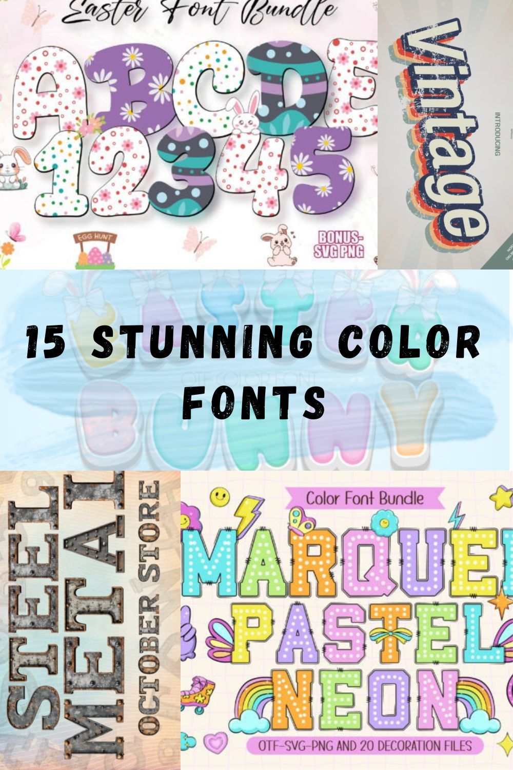
15 Stunning Color Fonts for Modern and Creative Designs
Color fonts completely changed the way I approach design. Instead of building everything from scratch with layers and effects, I can now drop in typography that already carries its own personality, depth, and color.
In this post, I’m sharing 15 color fonts that I’ve been using in my recent projects. These fonts help me move faster, experiment more, and create visuals that feel bold and modern without overcomplicating the process.
If you’re looking to add more energy and expression to your work, these color fonts might become one of your favorite tools too.
1. Dotted Easter Color Color Font

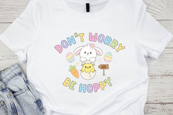
When the spring season kicks into high gear, I find myself reaching for typefaces that do more than just sit on a page—they need to radiate energy. Dotted Easter is a standout example of why I’ve started obsessed over color fonts lately; it takes that iconic, nostalgic dotted eggshell pattern and translates it into a vibrant, multi-tonal experience. As a designer, what I love most is that it arrives with a palette of five festive colors pre-baked into the glyphs, perfectly capturing the joyful, sun-drenched spirit of the holiday. It’s my go-to secret weapon for when a project needs to feel instantly celebratory without me having to manually layer colors for hours.

In my own studio workflow, I’ve found that this specific color font is an absolute powerhouse for DIY craft projects and personalized gift tags. The fact that it comes with 20 matching bonus doodles is a total game-changer for consistency—I can sprinkle those little accents across a T-shirt design or a party invitation and know the «Easter cheer» is perfectly synchronized. Whether I’m mocking up a high-impact holiday poster or a series of playful social media quotes, it delivers a level of «instant finish» that standard monochrome typefaces just can’t touch. If you’re looking to refresh your toolkit with color fonts that feel both modern and festive, Dotted Easter is a high-impact essential that saves time while boosting the fun factor.
2. Preppy Coquette Color Font

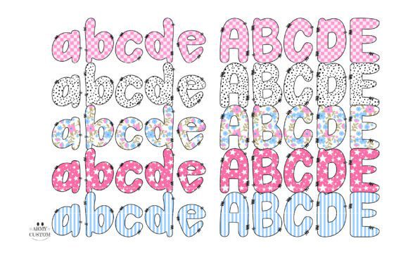
When I want to channel that classic Americana aesthetic with a soft, feminine twist, the Preppy Coquette Color Font is the first thing I pull from my library. As a designer, I’m obsessed with how color fonts allow us to layer complex textures—like these delicate retro floral motifs—directly into the letterforms without ever touching a clipping mask. This typeface is a gorgeous journey into a «coquette» world where every stroke and curve is embedded with a nostalgic, national spirit. It’s my go-to secret weapon for projects that need to feel sophisticated, timeless, and just a little bit «yesteryear.»
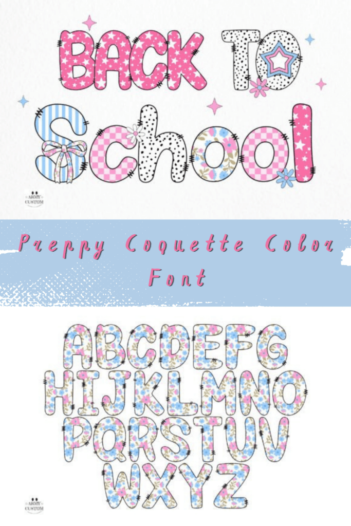
In my own studio workflow, I’ve found that Preppy Coquette is an absolute powerhouse for high-end lifestyle branding, editorial layouts, and personalized stationery that requires an unmistakable flavor of elegance. Unlike standard flat typefaces, the built-in chromatic depth of color fonts like this one brings a tactile, vintage quality to the screen that feels both expensive and artisanal. Whether I’m mocking up a logo for a boutique fashion brand or designing a series of floral-themed social media headers, it delivers a level of «preppy grace» that is hard to replicate. If you’re looking to experiment with color fonts that bridge the gap between retro Americana and modern chic, this floral-infused display face is an essential addition to your creative toolkit.
3. The Sports Collection Color Font

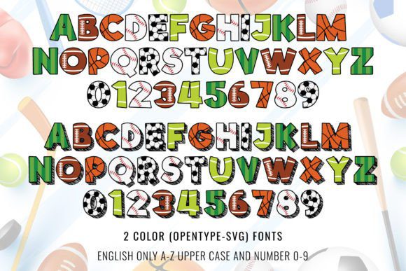
When I’m drafting a layout for a local tournament or a high-energy fan brand, The Sports Collection is the ultimate MVP in my library. As a designer, I’ve found that many athletic typefaces feel a bit too rigid or monochrome, but these color fonts bring «game day» to life with zero effort. This massive pack isn’t just one style; it contains 14 fonts from seven different typefaces, each bursting with playful, pre-baked colors that scream team spirit. It’s my go-to secret weapon for when I need to jump between baseball, basketball, and beyond without losing a cohesive, vibrant aesthetic across an entire project.
In my own studio workflow, I’ve found that color fonts like this one are absolute lifesavers for creating custom apparel, phone cases, and high-impact sports stickers. While the color OTF files are perfect for creating eye-catching posters in Illustrator or Photoshop, I love that the set includes a black version compatible with Cricut for physical craft projects. Whether I’m mocking up a series of team mugs or designing «all-star» gift tags, it delivers a level of «built-in» professional finish that would take hours to manually layer. If you’re looking to dive into the world of color fonts with a versatile, thematic powerhouse, The Sports Collection is a high-impact essential for any athletic-focused creative toolkit.
4. Composition Book Pattern Color Font
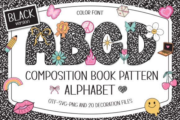
When I want to lean into that «back-to-school» nostalgia with a modern, Y2K twist, the Composition Book Pattern is the first typeface I pull from my stash. As a designer, I’m constantly looking for color fonts that can tell a story, and this one perfectly captures the iconic black-and-white marbled texture of a vintage classroom notebook. But what really sets it apart from a standard display face is the way it integrates 20 different Y2K-style doodle cliparts directly into the letterforms. It’s my go-to secret weapon for projects that need to feel academic yet undeniably cool—think classroom decorations, student learning tools, or high-energy scrapbook layouts.
In my own studio workflow, I’ve found that color fonts like this one are absolute lifesavers for T-shirt and merch sublimation. The pre-baked «notebook» pattern saves me from manually masking textures into every single character. I especially love that while the vibrant color version works perfectly in Illustrator and Photoshop, there’s also a black version that is fully compatible with Cricut for physical DIY craft projects. Whether I’m designing personalized names for student cubbies or a high-impact poster for a youth brand, it delivers a level of «vintage classroom charm» that feels both playful and professional. If you’re looking to experiment with color fonts that bridge the gap between retro education and modern aesthetics, this composition-inspired face is an essential addition to your creative toolkit.
5. Back to School Doodle Color Font
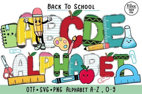
When the late summer air starts to cool, my design queue always fills up with education-themed requests, and the Back to School Doodle set is the first thing I pull from my stash. As a designer, I’m constantly looking for color fonts that can capture that specific «first day of school» energy—that mix of excitement, fresh notebooks, and scribbled margins. This font is a masterclass in OpenType-SVG technology; it doesn’t just give you letters, it gives you fully rendered, hand-drawn characters that feel like they were sketched right into a student’s diary. It’s my go-to secret weapon for making educational posters and notebook covers that actually look relatable to kids and parents alike.
In my own studio workflow, I’ve found that color fonts like this one are absolute lifesavers for boutique merchandise like team shirts, mugs, and personalized school bags. Because the colors and textures are pre-baked into the font file, I can skip the tedious layering process in Illustrator or Photoshop and go straight to the fun part of the layout. While the OTF files are perfect for high-end design software, I love that this set includes SVG and PNG versions, making it accessible for my projects in Canva or Cricut. Whether I’m mocking up a series of playful stickers or a header for a teacher’s blog, it delivers a level of «doodle-filled charm» that standard monochrome faces just can’t match. If you’re looking to inject some creative, classroom-inspired personality into your work, this is one of those color fonts that makes the entire design process feel like a fun afternoon project.
6. Spring Bee Color Font
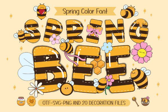
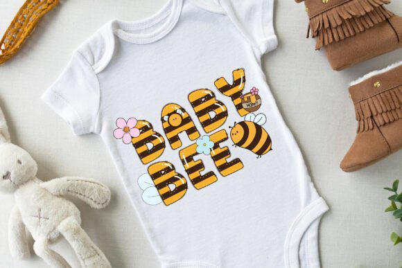
When the garden starts to wake up, I always look for typefaces that can bring that same buzzing energy to my screen, and Spring Bee is exactly that. As a designer, I’ve found that the real magic of color fonts lies in their ability to handle intricate patterns—like this charming bee-and-blossom motif—without requiring me to spend hours in Illustrator masking textures into every letter. This font is a masterclass in kid-friendly aesthetics, combining a playful, chubby bee character with a palette that feels as fresh as a sunny April morning. It’s my go-to secret weapon for projects that need to feel «un-bee-lievably» cute and full of life.
In my own studio experiments, I’ve found that color fonts like this one are absolute powerhouses for spring-themed posters and custom name projects for kids’ bedrooms. The set even includes 20 matching doodle cliparts, which is a total lifesaver for creating a cohesive brand story across T-shirts and DIY crafts. While the vibrant color OTF version is perfect for high-end layouts in Photoshop or Inkscape, I love that the designer included a black version for my Cricut cutting projects. Whether I’m mocking up a series of funny, bee-inspired quotes or designing a bright greeting card, it delivers a level of «instant cheer» that standard monochrome faces just can’t touch. If you want your creative work to truly buzz, adding these types of color fonts to your toolkit is a total game-changer.
7. Groovy Daisy Color Font


When a project calls for a retro 70s revival with a fresh, botanical twist, Groovy Daisy is the first typeface I load into my workspace. As a designer, I’ve seen plenty of flower-themed typefaces, but the way color fonts handle multi-tonal palettes is on a different level entirely. This specific 4-color font is a vibrant celebration of spring, using cheerful daisy motifs and a «groovy» silhouette to capture that effortless, flower-festival energy. It’s my go-to secret weapon for when a design needs to feel nostalgic yet bright, making it a perfect match for kid-friendly branding and playful, high-impact headers.
In my own studio workflow, I’ve found that color fonts like this one are absolute lifesavers for creating custom T-shirts, spring posters, and high-energy social media quotes. The set even comes with 20 matching doodle cliparts, which I love to use as supporting elements to tie a whole DIY craft project together. While the color OTF files are perfect for creating rich, textured layouts in Photoshop or Illustrator, the inclusion of a black version for Cricut means I can switch from digital design to physical merch without a hitch. Whether I’m mocking up a personalized name for a nursery or a series of vibrant gift tags, it delivers a level of «retro sunshine» that standard monochrome fonts simply can’t replicate. If you want to inject some flower-power into your toolkit, these kinds of color fonts are a professional-grade shortcut to a lively, seasonal aesthetic.
8. Hello School Color Font

When the «Back to School» season hits, my studio usually turns into a whirlwind of educational posters and classroom branding. That’s exactly when I pull out Hello School, a typeface that perfectly impersonates the nervous, vivacious joy of a first day back in the classroom. As a designer, I’m constantly looking for color fonts that save me time on palette selection, and this one is a creative playground, coming pre-designed in an assorted mix of six vibrant colors. Every character feels like it was inscribed with an educator’s precision, making it a standout choice for projects that need to embody a genuine love for learning.
In my own creative workflow, I’ve found that color fonts like this one are incredibly versatile for everything from school-themed social media headers to personalized student name tags. Unlike standard monochrome typefaces that can feel a bit sterile, the striking chromatic layers in Hello School confidently stand out, bringing a sense of «academic spirit» to life with zero extra effort. Whether I’m designing a playful logo for a tutoring center or a high-impact «welcome back» banner, it delivers a professional, polished finish that feels both modern and nostalgic. If you want to embrace the spirit of academia in your next design, adding these types of color fonts to your toolkit is a brilliant way to ensure your message is as bright as a gold-star student.
9. Summer Beach Color Font

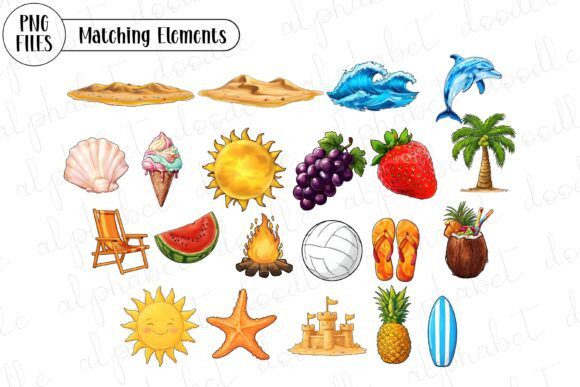
When the temperature rises and my clients start dreaming of coastal branding, Summer Beach is the first typeface I load onto my canvas. As a designer, I’m constantly looking for ways to capture that «golden hour» glow without spending hours manually tweaking gradients, and that is exactly why I’ve become so obsessed with color fonts. This specific typeface emanates the inviting warmth of a sun-kissed vacation, infusing every character with a youthful exuberance and an amiable charm. It’s my go-to secret weapon for projects that need to feel like a serene holiday—bringing a splash of radiant, multi-tonal energy to the screen that standard monochrome fonts just can’t replicate.
In my own studio workflow, I’ve found that Summer Beach is an absolute powerhouse for high-impact seasonal posters and personalized t-shirts that crave a dollop of joyous vitality. While the vibrant color version is a dream to work with in programs like Photoshop and Illustrator, I really appreciate that it includes a black version for my Cricut and other cutting machine projects. Whether I’m mocking up a series of cheerful vacation quotes or designing a bold header for a travel blog, it delivers a level of «visual sunshine» that feels both professional and incredibly fun. If you’re looking to refresh your library with color fonts that bridge the gap between retro surf vibes and modern chromatic design, this beach-inspired display face is a high-impact essential for your summer toolkit.
10. Baseball Bundle Color Font
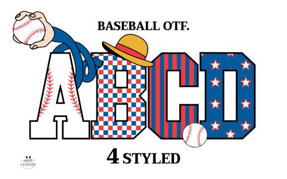

When I’m working on a youth league project or a high-energy school spirit campaign, the Baseball Army typeface is the heavy hitter I bring to the plate. As a designer, I’ve found that the real beauty of color fonts lies in their «chunky,» playful authenticity—they have a weight and a vibrancy that standard flat fonts simply can’t match. This specific font is a masterclass in kid-friendly design, embodying a sense of movement and «game day» excitement that makes any layout come alive. It’s my go-to secret weapon for when a design needs to feel both authentic to the sport and approachable for a younger audience.
In my own studio workflow, I’ve found that color fonts like this one are absolute lifesavers for making school projects and children’s activities pop with charm. While the color OTF files are perfectly suited for high-end design in Photoshop CC or Illustrator CC, I love that the bundle includes bonus PNG files to keep things flexible for other platforms. Whether I’m mocking up a series of vibrant «Back to School Plaid» themed graphics or designing a celebratory team banner, it delivers a level of «visual home run» energy that is hard to find elsewhere. If you’re looking to diversify your library with color fonts that bridge the gap between athletic bold and creative fun, the Baseball Bundle is a top-tier essential for any designer’s creative toolkit.
11. Mother Day Heart Color Font
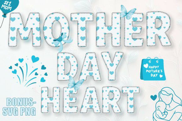

When May rolls around and my inbox starts filling up with requests for sentimental, family-oriented branding, the Mother Day Heart alphabet is the first asset I pull from my stash. As a designer, I’m always looking for color fonts that can convey a «handmade with love» feel without me having to manually illustrate every flourish. This font is a masterclass in soft, feminine aesthetics; it features charming heart-style details integrated directly into the letterforms, all rendered in a pre-set palette of tender hues. It’s my go-to secret weapon for projects that need to feel sweet, heartfelt, and perfectly aligned with a «Love Mom» theme.
In my own studio workflow, I’ve found that color fonts like this one are absolute lifesavers for high-impact sublimation projects like custom mugs and T-shirts. The built-in chromatic depth adds a level of sophistication to greeting cards and planners that standard flat typefaces just can’t touch. Whether I’m mocking up a series of adorable stickers or designing a soulful social media graphic for a family celebration, it delivers a level of «visual affection» that feels both professional and deeply personal. If you’re looking to expand your library with color fonts that bridge the gap between elegant typography and whimsical illustration, this heart-filled display face is a high-impact essential for any Mother’s Day toolkit.
12. Illuminated Initials Color Font


When I’m tasked with a project that needs to feel ancient, authoritative, or steeped in mystery, Illuminated Initials is the first asset I pull from my digital vault. As a designer, I’ve always been fascinated by the artistry of medieval manuscripts, and exploring how color fonts can replicate that complex, hand-painted look is a total game-changer. This gothic blackletter face doesn’t just provide letters; it offers dark-aged style squares with angular, dramatic strokes that carry a powerful, brooding presence. It’s my go-to secret weapon for when a design needs to bridge the gap between historical tradition and modern, high-impact digital art.
In my own studio experiments, I’ve found that color fonts like this one are absolute powerhouses for atmospheric book covers, luxury invitations, and bespoke signage. The pre-baked chromatic depth within the «illuminated» boxes gives the typography a tactile, three-dimensional quality that standard flat fonts simply can’t achieve without hours of manual layering. Whether I’m mocking up a title for a historical fantasy novel or designing a series of enigmatic posters, it delivers a level of «medieval flair» and intrigue that instantly anchors the entire layout. If you’re looking to diversify your library with color fonts that command attention through gothic elegance and bold, dramatic weight, Illuminated Initials is a high-impact essential for any creative toolkit.
13. Halloween Bone Color Font

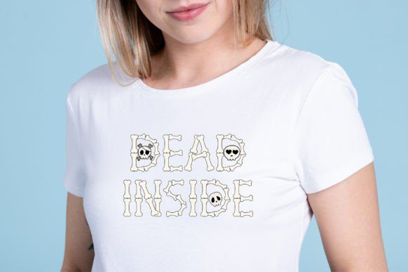
When the spooky season rolls around and my studio starts smelling like pumpkin spice, Halloween Bone is the first typeface I drag out of the digital crypt. As a designer, I’ve seen countless horror typefaces, but the way color fonts allow for realistic textures and bone-white shading is a complete game-changer for my October workflow. This isn’t just a flat silhouette; it’s a beautifully rendered, skeletal display face that carries a distinct «eerie elegance.» It’s my go-to secret weapon for when a project needs to feel macabre yet sophisticated—perfect for high-impact headers that need to look like they were unearthed rather than typed.
In my own creative experiments, I’ve found that color fonts like this one are absolute powerhouses for custom DIY Halloween projects and personalized name designs for spooky merch. The set even includes 10 matching skull clip arts, which I love to use as anchor points for my sublimation layouts and festive posters. Unlike standard monochrome fonts that require manual grain and shadowing, the pre-baked textures in Halloween Bone deliver an instant, professional «haunted» finish. Whether I’m mocking up a series of festive party invitations or designing a chilling social media banner, it provides a level of depth and «bone-chilling» detail that is hard to find elsewhere. If you’re looking to haunt your design library with color fonts that bridge the gap between festive fun and anatomical detail, this skeletal display face is a high-impact essential for any creative’s toolkit.
14. Super Graffiti Color Font
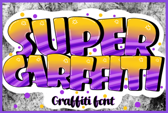
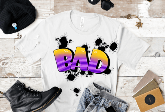
When a project demands a high-energy, urban vibe with a polished finish, Super Graffiti is the first asset I pull from my design vault. As a designer, I’ve spent years manually adding outlines and drips to standard street-style typefaces, but the advent of color fonts has completely changed the game. This specific display font captures that raw, «fresh off the wall» energy but refines it into a vibrant, multi-layered aesthetic that pops instantly. It’s my go-to secret weapon for when a brand needs to feel youthful, bold, and just a little bit rebellious without losing that professional, «ready-to-print» polish.
In my own studio experiments, I’ve found that color fonts like this one are absolute powerhouses for everything from high-impact book covers to dynamic children’s games. The pre-baked chromatic depth gives the letters a 3D, «inflated» look that standard monochrome fonts just can’t replicate without a dozen clipping masks. Whether I’m mocking up a logo for a street-wear brand or designing a series of playful posters for an urban event, it delivers a level of «visual joy» and street-cred that feels both authentic and modern. If you’re looking to inject some high-octane personality into your work, adding these kinds of color fonts to your toolkit is a surefire way to make your creative titles and brand names stand out in a crowded market.
15. Colors Polka Dots Color Font
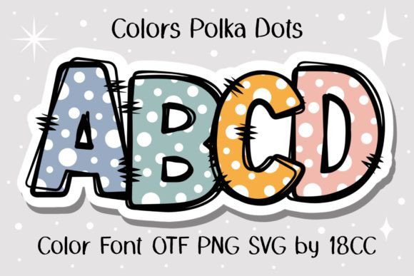

When I’m looking to inject a sense of pure, unadulterated whimsy into a layout, Colors Polka Dots is the first typeface I load into my workspace. As a designer, I’ve found that the real magic of color fonts lies in their ability to handle repetitive, multi-colored patterns—like these charming dots—without me having to manually align a single circle. This font is a masterclass in playful aesthetics, offering a «confetti» style vibrancy that feels like an instant celebration on the page. It’s my go-to secret weapon for when a project needs to feel approachable, lighthearted, and full of tactile energy.
In my own studio workflow, I’ve found that color fonts like this one are absolute powerhouses for social media graphics and crafty DIY projects. The pre-baked chromatic textures give the letters a «bubbly» personality that standard monochrome fonts just can’t replicate. While the rich color OTF version is a dream for high-end digital design in Photoshop or Illustrator, I love that it includes a black version specifically for my Cricut and other cutting machines. Whether I’m mocking up a custom t-shirt design or creating a series of vibrant stickers, it delivers a level of «visual joy» that is hard to find in standard display faces. If you’re looking to diversify your library with color fonts that bridge the gap between retro charm and modern fun, Colors Polka Dots is a high-impact essential for any creative toolkit.
Final Thoughts
Working with color fonts has opened up a lot of creative possibilities for me. They’re not just about convenience — they bring a unique style that’s hard to replicate with standard typography.
What I like most is how easily they fit into different types of projects, whether it’s social media graphics, branding, or digital content. You can keep things simple or go all in and make typography the main visual element.
If you haven’t explored color fonts yet, it’s definitely worth trying them in your next project. Sometimes, the right font does most of the design work for you.